The rapid evolution of cloud technologies gave access to new exciting ways to innovate our businesses. Whether we analyse an image to extract context, automatically translate documents in multiple languages or forecast trends with machine learning algorithms, the latest technological advancements put tremendous power in the hands of cloud services designers like us.
But, as the famous slogan of Pirelli claimed a few decades ago:
Power is nothing without control.
When delivering products to our final users, we need to make sure the result is pleasant, and the high complexity of the services behind the scene is masked with an effective and easy to use interface.

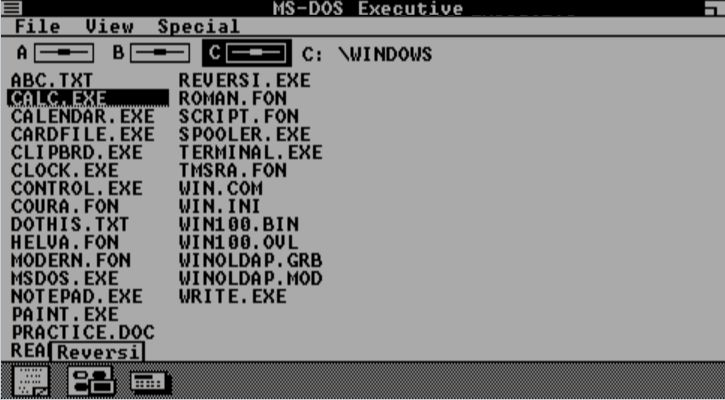
We indeed walked a long way since the first command-line interfaces, with milestones like the mouse or the first touch screen devices — up to the latest voice-control or Augmented Reality interfaces.

Who can imagine where the next ten years of technological evolution will lead us!
Nevertheless, with a focus on the present times, most applications rely on screens controlled by gestures, trackpad, mouse, keyboard and voice. Moreover, mobile devices gave us a whole new level of flexibility: we can access our favourite tools, including business applications, from any part of the world. Therefore, it's essential to design User Interfaces able to adapt based on the size of the screen or the kind of device.
This puts a lot of pressure on the shoulders of developers and designers, who have to create applications that can be used seamlessly from a 20'' laptop to a 4'' phone. Depending on the type of application, you even have to deal with televisions, watches, or one of the many IoT devices. Furthermore, each device has its own operating system (the software that runs the applications), each speaking a different "language".
This pressure is often reflected on the project's budget and finally on the customer's money.

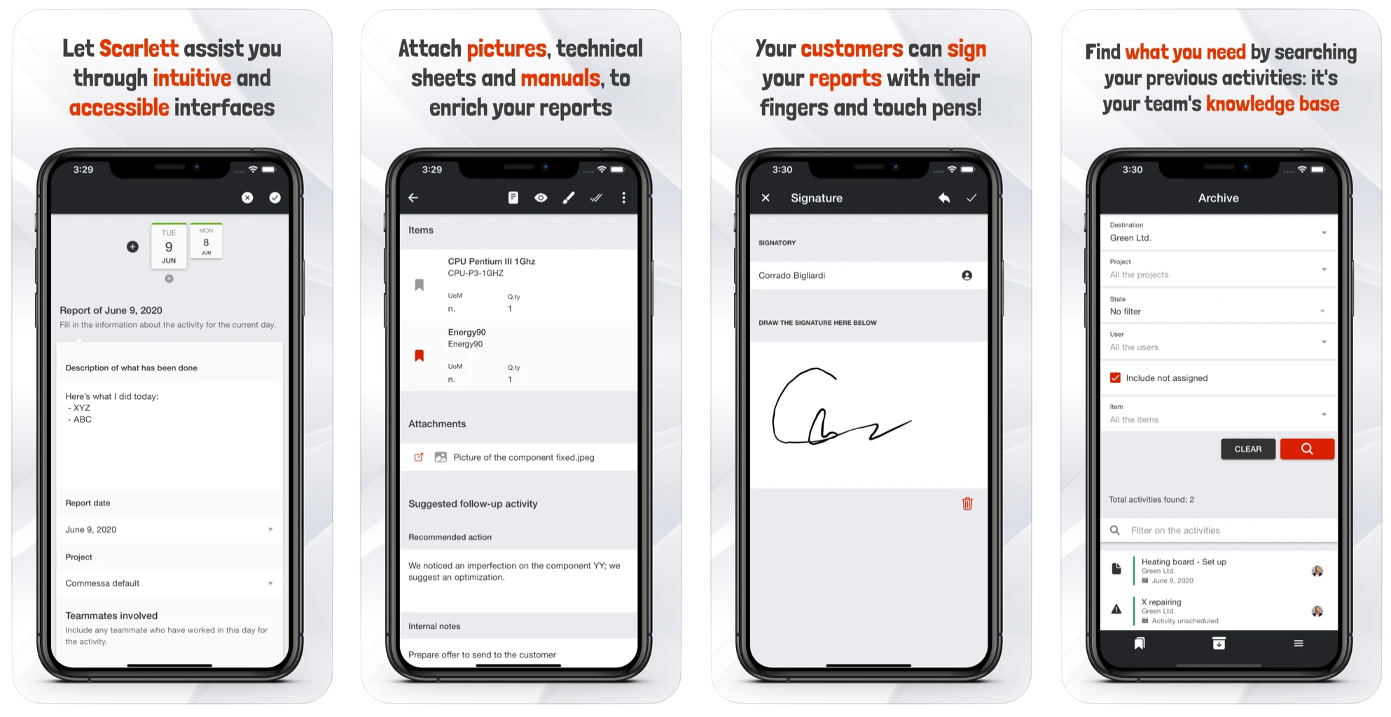
To be able to deliver powerful cloud services, dressed in beautiful apps running on almost any kind of device, we at ITER IDEA are working since the very beginning with state-of-the-art web technologies. This allows us to create consistent user experiences regardless of the kind of device while keeping the costs of the projects low.
In a previous article on our blog, we talked about the evolution of this area, with Hybrid applications and Progressive Web Apps slowly taking the lead. The applications generated with these architectures enabled you to create web apps for either desktop or mobile devices, taking advantage of (many of) their native capabilities — thanks to frameworks as Apache Cordova.
A few years later, in the new '20s, the latest trend is called Web Native.
This particular construct describes those kinds of native apps built with web technologies, supported by advanced frameworks (like Capacitor) to access the specific devices' capabilities. In simple words, you can create ONE gorgeous application that runs natively on iOS, Android, Desktop, and Web. The math is simple: one fully-featured app, fewer development costs, lower adoption barrier, happier customers.

All of our products are categorised as Web Native,
and they are built with the best web languages (HTML5, SCSS and Typescript) on solid and popular frameworks such as Angular and Ionic. You can use them with your browser or download them from your favourite app store. You can take pictures, speech-to-text your thoughts, receive push notifications and access all the cloud and device functionalities we often talk about in our blog.
In terms of IT technology, what a few years ago was brand new, is already becoming obsolete; surround your business with passionate partners able to support you in the technological challenges of tomorrow!
Are you ready to develop your next idea? Contact us!


